
Scott Berinato, the author of Good Charts, makes excellent points about the importance of balance over perfection when making effective charts. He mentions that the purpose of good visualizations is not to make them more attractive to the audience, but easier to understand, and to achieve that, there are some techniques that can be applied when creating any type of visual.
Structure
Effective charts or visuals, like written communication pieces, follow a specific structure to make them neat and clean. Balanced charts are made up of four elements, with each element having a consistent weight in the representation:
- Title, weighting 12% of the visual.
- Subtitle, consisting of 8% of the visual.
- Visual field, making up 75%, which included, axes, labels, captions, and legends.
- Source line, taking 5%.
Clarity
For charts that are easy to be interpreted, Scott Berinato points out to focus on design clarity to achieve balance. This means, removing as much unnecessary elements as possible, without losing the meaning of the chart. Also, making the elements support the visual and avoid at all cost ambiguity. Each element should be focusing on a single purpose within the visual being presented.
Simplicity
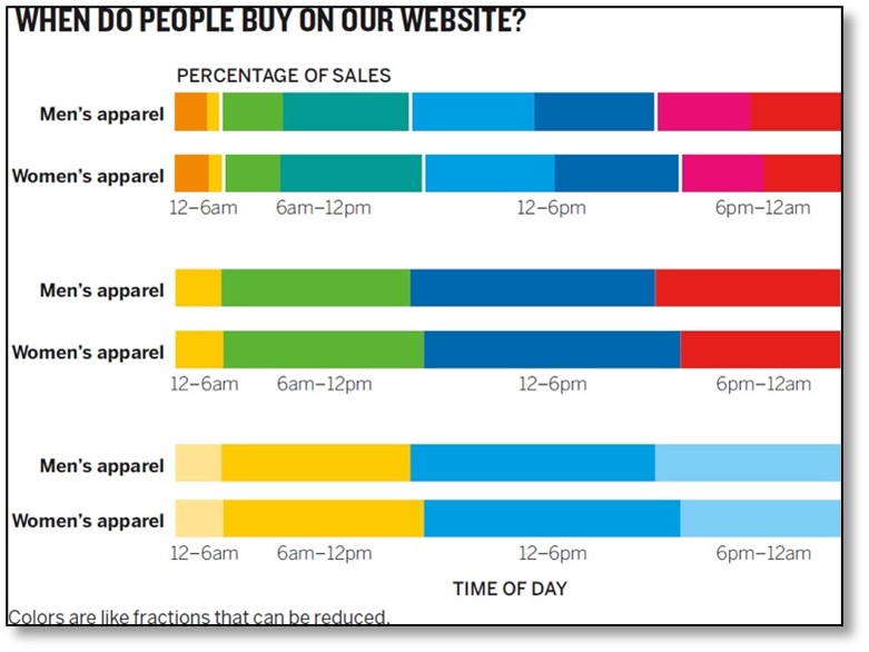
Lastly, to make charts look elegant, Scott Berinato points to design simplicity. The chart to be effective should only show what is needed and minimize the number of colors use. Gray makes a great color for contextual and second-level information and for structural elements such as grid lines. In addition, keeping eye travelling at a minimum by placing labels and legends near to what they describe, builds on simplicity.